Data Elements: Building a First Principles Approach to Operational Metrics
- Umashree

- May 12
- 9 min read
After two decades working with distribution operations, I've observed a peculiar paradox: most companies are simultaneously drowning in data while starving for insight. Dashboards multiply, reports pile up, and spreadsheets proliferate—yet leaders still struggle to answer fundamental questions about their operations.
"What metrics should we be tracking?"
"How do we know if our operation is truly improving?"
"Why don't our dashboards help us make better decisions?"
These questions reveal a deeper issue: the failure to understand data elements as fundamental building blocks of operational visibility. When we apply first principles thinking to operational metrics, we discover that data isn't just something we collect—it's an essential element that must be intentionally designed.
Understanding Data Elements in Distribution Operations
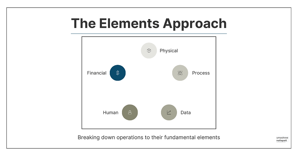
Like physical elements (inventory, equipment) and process elements (workflows, decision points), data elements form a critical component of your operational infrastructure. But unlike their more tangible counterparts, data elements are often created haphazardly, accumulated through history rather than designed with purpose.
A mid-sized electrical distributor I worked with had implemented an expensive business intelligence system, creating dozens of dashboards with hundreds of metrics. Yet during our first meeting, the COO confessed, "We have all these charts and graphs, but I still can't tell if we're getting better or worse at serving our customers."
This disconnect between data abundance and insight scarcity stems from a fundamental misunderstanding of data elements.
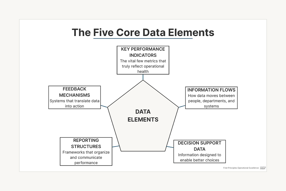
The Core Data Elements Every Distributor Must Master
Through my work with dozens of distribution operations, I've identified five core data elements that form the foundation of operational visibility:
Key Performance Indicators (KPIs): The vital few metrics that truly reflect operational health
Information Flows: How data moves between people, departments, and systems
Decision Support Data: Information specifically designed to enable better choices
Reporting Structures: The frameworks that organize and communicate performance
Feedback Mechanisms: Systems that translate data into action and improvement
Most distributors focus almost exclusively on KPIs while neglecting the other four elements. This imbalance explains why many data initiatives fail to deliver meaningful operational improvements.
The Map Is Not the Territory: Why Most Dashboards Fail
Charlie Munger often references the concept that "the map is not the territory"—a reminder that our models and representations of reality are not reality itself. This insight is particularly relevant to operational dashboards.
Most dashboards are developed with a fundamental misunderstanding: that visualization alone creates understanding. But dashboards are merely maps of your operation, not the territory itself. When these maps are poorly designed or disconnected from operational reality, they become worse than useless—they become misleading.
Consider these common dashboard failures I've encountered:
The Everything Dashboard: Crammed with dozens of metrics, overwhelming users with information overload
The Lagging Indicator Collection: Filled with metrics that tell you what happened last month, not what's happening now
The Disconnected Display: Beautiful visualizations with no clear connection to actionable decisions
The Averaged Abstraction: Metrics that aggregate across different products, locations, or time periods, masking important variability
The Confirmation Collection: Data selected to confirm existing beliefs rather than challenge assumptions
A building materials distributor I advised had fallen into several of these traps. Their main operational dashboard featured 32 different metrics, updated monthly, with no clear hierarchy or connection to daily decisions. The dashboard looked impressive but proved practically useless for guiding improvement.
Applying First Principles to Dashboard Design
Instead of starting with the question "What metrics should we track?", first principles thinking demands we ask more fundamental questions:
What critical decisions drive operational performance?
What specific information would make those decisions better?
How can we present that information to make its implications obvious?
How will we know if our actions are improving outcomes?
When the electrical distributor mentioned earlier applied these questions, they scrapped their sprawling dashboard collection and replaced it with three focused views:
A Decision Support Dashboard showing information specifically needed for daily operational choices
A Trend Analysis View revealing patterns and changes in critical performance areas
A Performance Scorecard clearly connecting strategic goals to operational metrics
This first principles redesign transformed their relationship with data, making it a tool for improvement rather than merely a record of the past.
Leading vs. Lagging Indicators in Distribution Operations
One of the most consequential distinctions in operational metrics is between leading and lagging indicators. Yet in my experience, most distribution operations focus almost exclusively on lagging indicators.
Lagging indicators tell you what happened in the past: inventory turns last month, on-time delivery percentage last week, lines picked per hour yesterday. They're important for understanding performance, but they're autopsy reports—they can tell you why the patient died, but they can't help you prevent the death.
Leading indicators, by contrast, predict future outcomes. They measure the drivers of performance rather than the results. For distributors, critical leading indicators might include:
Order backlog composition (predicts fulfillment challenges)
Inventory exceptions identified during cycle counts (predicts fill rate issues)
Communication cycle time between departments (predicts service failures)
Error rates at critical decision points (predicts quality problems)
Resource availability vs. forecasted demand (predicts capacity constraints)
A plumbing products distributor I worked with had been tracking on-time delivery percentage religiously—a classic lagging indicator. Despite this focus, their performance remained stubbornly inconsistent. When we implemented leading indicators, including order backlog composition and picking queue alignment, they could finally see problems forming before they impacted performance.
Within three months, their on-time delivery improved from 87% to 96%, not because they had better measurement of past performance, but because they could now see problems developing before they affected customers.

The Secret to Implementing Leading Indicators
Many operations leaders understand the theoretical value of leading indicators but struggle to implement them effectively. Through dozens of implementations, I've discovered these key principles for success:
Start with the outcome: Identify the lagging indicator you want to improve
Map the causal chain: Work backward to identify the factors that influence that outcome
Look for measurable precursors: Find early warning signs that problems are developing
Establish thresholds: Determine what levels should trigger action
Connect to specific responses: Define exactly what actions should follow when thresholds are crossed
The plumbing distributor implemented a daily "Fulfillment Risk Assessment" that applied these principles. Each morning, they evaluated seven leading indicators that collectively predicted fulfillment challenges. Based on predetermined thresholds, specific countermeasures were triggered automatically—before service failures could occur.
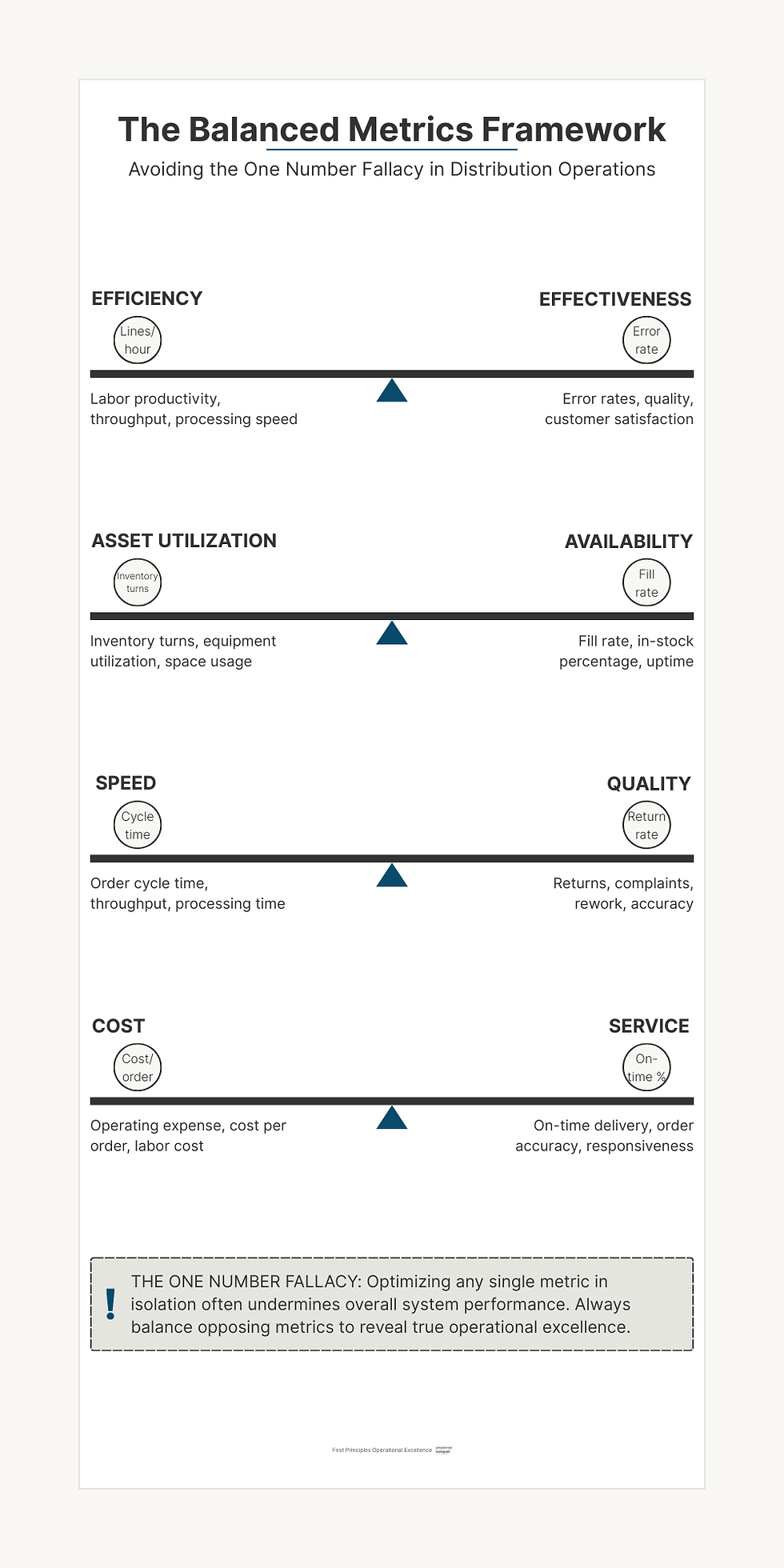
The One Number Fallacy: Why Single Metrics Lead to Suboptimization
Distribution operations are complex systems where optimization in one area often creates problems elsewhere. This reality crashes headlong into the common desire for simplification—what I call the "One Number Fallacy."
I've seen this pattern repeatedly: an operation focuses intensely on optimizing a single metric, only to discover they've undermined overall system performance. Classic examples include:
Maximizing lines picked per hour, leading to increased error rates
Optimizing inventory turns, causing fill rate problems
Improving labor efficiency, while increasing lead times
Reducing cost per order, but increasing customer complaints
A lumber distributor I advised had fallen into this trap, focusing obsessively on inventory turns. They succeeded in driving turns from 4.2 to 8.1 over eighteen months—an impressive achievement by conventional standards. But during the same period, their fill rate plummeted from 98% to 86%, and their emergency replenishment costs more than doubled.
By optimizing a single metric in isolation, they had severely damaged overall system performance and customer satisfaction.
Balanced Metrics: The First Principles Approach
First principles thinking rejects the One Number Fallacy in favor of balanced measurement systems. Instead of seeking a single metric to optimize, we need counterbalanced metrics that reveal system-level performance.
For most distributors, key counterbalanced pairs include:
Efficiency vs. Effectiveness: Labor productivity balanced against error rates
Asset Utilization vs. Availability: Inventory turns balanced against fill rate
Speed vs. Quality: Throughput balanced against returns and complaints
Cost vs. Service: Operating expense balanced against customer satisfaction
The lumber distributor reformed their approach by implementing a balanced scorecard that explicitly paired inventory turns with fill rate. By visualizing these metrics together rather than separately, they made the trade-off visible and could make more intelligent decisions about where to position themselves on that spectrum.
Designing a First Principles Approach to Operational Metrics
If you're ready to rethink your approach to data elements, here's a structured method I've used successfully with dozens of distributors:
1. Metric Decomposition
Start by breaking down your current metrics to understand their fundamental purpose:
What decision is this metric supposed to inform?
Is it measuring a cause or an effect?
How directly does it connect to strategic goals?
Who uses this information and how?
When a foodservice distributor applied this analysis to their 47 existing KPIs, they discovered that only 9 were regularly used for decision-making. The rest were "zombie metrics"—undead numbers that consumed resources without adding value.
2. Decision Mapping
Next, inventory the critical decisions that drive operational performance:
What are the high-leverage decisions made daily?
Who makes these decisions?
What information would make these decisions better?
How quickly does this information need to be available?
A fastener distributor used this approach to identify 23 critical decision points across their operation. For each, they documented the specific information needed, creating a "decision support map" that guided their metrics redesign.
3. Element Integration
Connect your data elements to other operational elements:
Which physical elements need measurement?
Which process elements generate or consume data?
How do human elements interact with information?
What financial implications does each metric have?
An HVAC distributor created a cross-reference matrix showing how each proposed metric connected to their physical, process, and human elements. This integration view revealed critical gaps where important elements lacked appropriate measurement.
4. Implementation Hierarchy
Finally, sequence your implementation based on impact and feasibility:
Which metrics will drive the greatest improvement?
Which can be implemented most quickly?
What dependencies exist between metrics?
How will you validate that the metrics improve decisions?
The Implementation Roadmap: From Concept to Operational Reality
Transforming your approach to data elements isn't a single project but an ongoing journey. Based on my experience guiding dozens of distributors through this process, I recommend this implementation roadmap:
Phase 1: Foundation (30 Days)
Metric Inventory: Document all current metrics and their usage
Decision Mapping: Identify critical decisions and information requirements
Gap Analysis: Determine where current metrics fail to support key decisions
Quick Wins: Implement 2-3 high-impact, easy-to-deploy metrics
Phase 2: Expansion (60 Days)
Leading Indicator Development: Design and implement 3-5 key leading indicators
Balanced Scorecard Creation: Develop counterbalanced metric pairs
Visualization Redesign: Create decision-focused dashboard views
Feedback Mechanisms: Implement regular review and response protocols
Phase 3: Integration (90 Days)
Cross-Functional Alignment: Ensure metrics support departmental collaboration
Decision Support Refinement: Tune metrics based on decision-maker feedback
Predictive Enhancement: Add trend analysis and forecasting capabilities
Performance Management Integration: Connect metrics to individual and team goals
A medical supplies distributor followed this roadmap after years of frustrated attempts to improve their metrics. Within 90 days, they had transformed their approach to data, creating a tight connection between measurement and action. Six months later, they had improved fill rates by 4.2%, reduced labor costs by 7.3%, and increased inventory turns by 1.1 turns—all without significant technology investment.
Taking Action: Your Next Steps
If you're ready to apply first principles thinking to your operational metrics, here are four concrete steps to begin today:
Conduct a Zombie Metric Audit: Identify which of your current metrics actually drive decisions and which are simply consuming resources without adding value.
Map One Critical Decision: Select a high-impact operational decision and document exactly what information would make that decision better.
Develop One Leading Indicator: For your most important lagging indicator, work backward to identify at least one measurable precursor that could provide early warning of problems.
Create One Balanced Pair: Identify a metric you're currently optimizing and determine what counterbalancing metric should be tracked alongside it to prevent suboptimization.
Remember, the goal isn't to create perfect metrics immediately. Instead, focus on making incremental improvements that move you closer to a first principles approach.
Building Your Data Element Mastery
Understanding and optimizing data elements is a capability that develops over time. As you progress on this journey, you'll find that previously confusing operational challenges become increasingly clear and solvable.
The electrical distributor I mentioned earlier ultimately transformed their entire approach to operations through better data elements. Three years after our first project, their CEO told me: "We used to think we had a warehouse efficiency problem. Now we understand we had a decision quality problem. Better metrics didn't just help us measure better—they helped us think better."
By breaking down your operation to its fundamental data elements, you gain the ability to rebuild with intention and purpose. In today's data-rich but insight-poor distribution landscape, this capability may be your most sustainable competitive advantage.
What's your biggest challenge with operational metrics? Have you experienced the "One Number Fallacy" in your operation? I'd love to hear your thoughts in the comments below.
Want a structured approach to selecting and implementing meaningful operational metrics? Drop a message using the contact form to get the Free First Principles Metric Selection Guide.


Comments